Think Mobile first for Google’s Mobile First Index

Think Mobile first for Google’s Mobile First Index
Mobile is the way to go when developing your website. Since the number of mobile users is only going to increase in the future, Google recommends everyone to ‘think mobile’ when creating websites that are responsive and produce high-quality on every device. It is of high importance to create consistent content across all the platforms – from mobile to desktop.
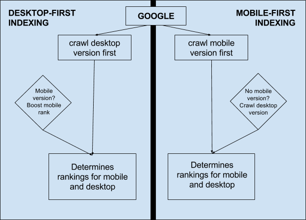
When creating websites, you should understand that Google crawls both – the desktop and mobile version.
When Google says that it recommends mobile-first indexing, it does not say that it will not crawl your desktop version. It’s just that when Google figures out that you have a mobile-friendly website up and running (which it recommends), it prefers to show your website higher than the websites that are not mobile-friendly.
This immensely helps to boost your page rank.

We also recommend you to move from the ‘mobile version’ of your website to a responsive design that works on all platforms.
It’s a great decision when you choose to create a responsive design for your website. But there have been instances when they fail to pass in their usability test.
If users are facing difficulties using your website on their device, they won’t think twice before pressing the back button and moving to your competitors.
In 2019, when a huge percentage of your website traffic will come from mobile devices, it is highly imperative to take appropriate measures.
With a totally responsive design, you’ll still want to ensure that mobile page speed and load time are prioritized. Not just that, images and other dynamic elements should also be optimised correctly for the mobile experience.
If you are going for a separate mobile site, you’ll want to check the following:
Content
When creating content, you should consider creating high quality and valuable content that already exists on your desktop website. Content may include texts, video, and images. When you include the alt-attributes to your images, your images become crawlable and indexable.
Structured Data
When it comes to structured data, you should include the same mark-up on both mobile and desktop version of the site. Make sure you put the mobile versions of the URL in the URLs mentioned within the structured data.
Metadata
You should ensure that titles and meta descriptions are of same character length on both mobile and desktop versions.
Social Metadata
Make sure you add the social metadata like OpenGraph tags, Twitter cards and other social metadata on mobile as well as desktop version.
XML and media sitemaps
Ensure that links to sitemap are easily accessible from the mobile version. This includes Robots.txt and privacy policy page. Try checking the Mobile-Friendly Test Tool from Google to see where your website stands. Just enter your website URL and the tool will show you if your website is mobile-friendly.
Chrome DevTool’s Device Mode is also a great tool to make sure you are building a mobile-friendly website. It utilizes the device mode and simulates a list of different portable devices. It shows how the website performed on all the portable devices.
Another Google tool you can use to check whether your site is fast enough for a mobile phone is Test My Site. It takes a minute to tell you the time required by your website to load on a device using a 3G connection.


